I'm trying to simplify. I've made things way more complicated than they need to be over the years. Instead of 'painted.', 'painted by lauren', or 'art and interiors' I'm just 'lmharrell'. I did feel a bit guilty abandoning my maiden name (since my parents put up with my shenanigans for so long), but what can you do.
Anywho, I love my freelance interior design jobs, but I wanted my website to focus on art. So, I'm moving my design pics to the bloggie-blog. Please excuse the quality!
 I was not in support of the red-orange accent wall, but overall this kitchen turned out great. It was a tight space, but utilizing the back of the peninsula that faced the living room made the kitchen feel a lot larger than it actually was.
~.~.~.~.~.~.~
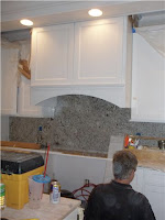
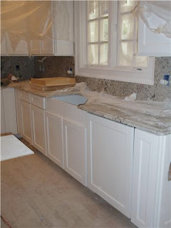
Before the building boom came to an end I worked with a high-end builder out of Atlanta. She always had a huge budget and great ideas. Needless to say, her projects where a lot of fun. She bought old houses in downtown Atlanta and completely gutted them. They always included building out a new space for a kitchen & master bedroom. I wish I had pictures of this entire house... it was amazing! 


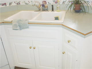
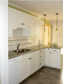
Never under-estimate a fresh coat of paint, new countertop, and some tile.
Check out these before & afters:
~before~
~before~
~after~
~.~.~.~.~.~.~.~.~
I curse the day I didn't take a 'before' of this kitchen. This was a tiny galley kitchen in an early 90s ranch. The homeowner went for a super sleek look.
~.~.~.~.~.~.~.~
Another project with no blank-idy-blank before pictures. This client had a pretty definitive look that she wanted... I just helped with space planning.
Believe it or not, this is in a small brick ranch built in the 60s.


